CSS Transitions
CSS transitions enable smooth changes to CSS property values over a specified duration, rather than having the changes happen instantly. This allows for more dynamic and visually appealing animations on a webpage.
Basic Syntax of CSS Transitions
The transition property is used to define which CSS properties should transition, the duration of the transition, the timing function, and any delay./* Transition Syntax */
/* Transition Syntax */
element {
    transition: property duration timing-function delay;
  }
div {
    background-color: black;
    height: 300px;
    width: 300px;

    border: 2px red solid;
    transition: 2s;
}

div:hover{
    background: red;
    margin: 200px;
}
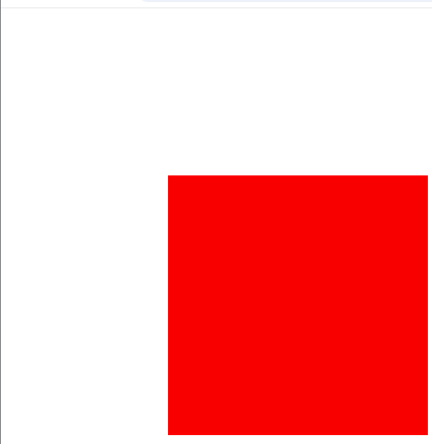
- On hovering it will move from left to right
Transition Shorthand
The transition shorthand property allows you to specify multiple transition properties in one line. The order of values is important:
Property: The CSS property to animate (e.g.,
width,background-color).Duration: The time the transition takes (e.g.,
2s,500ms).Timing Function: Defines the speed curve of the transition (e.g.,
ease,linear,ease-in,ease-out).Delay: The time before the transition starts (e.g.,
1s,200ms)
/* Transition Syntax */
element {
  transition: property duration timing-function delay;
}
div{
 transition: margin 2s ease-in 0.2s;
}
1. CSS Transform
CSS transforms allow you to move, rotate, scale, or skew elements without disturbing the document flow. Transforms work on 2D and 3D space.
Common Transform Functions:
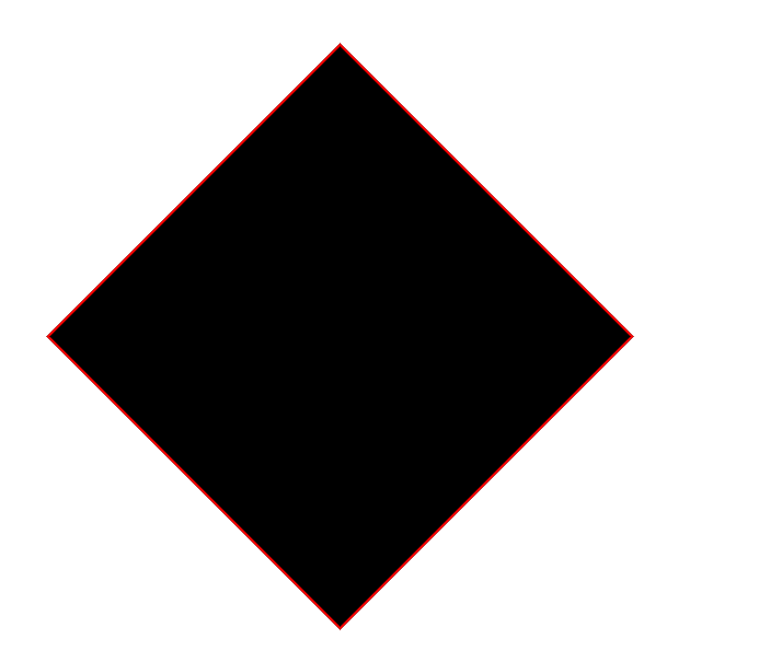
rotate():Rotates an element clockwise or counterclockwise by a specified angle.
The value is in degrees (
deg), radians (rad), or turns (turn).
div {
    background-color: black;
    height: 300px;
    width: 300px;
    margin: 100px;
    border: 2px red solid;
    transform: rotate(45deg);
}
scale():
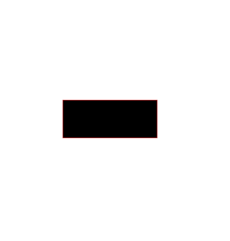
Scales an element up or down along the X and/or Y axis.
The value is a multiplier:
1means no scaling,0.5means 50% of the original size, and2means 200% of the original size.
div {
    background-color: black;
    height: 300px;
    width: 300px;
    margin: 100px;
    border: 2px red solid;
    transform: scale(0.5,0.2);
}
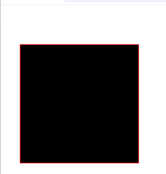
translate():Moves an element from its current position by the specified X and Y values.
The values are in length units (
px,em,%, etc.).
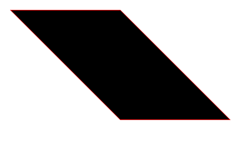
skew():Skews an element along the X and/or Y axis.
The value is in degrees and creates a slanting effect.
Using Transitions with Transforms
We can combine CSS transitions with transforms to create smooth animations.div {
div {
    background-color: black;
    height: 300px;
    width: 300px;

    border: 2px red solid;
    transition: transform 2s ease-in 0.2s;
}

div:hover{
    background: red;
    margin: auto;
    transition: skew(30deg) scale(1.2);
}
Summary of Key Concepts
Transition: Allows smooth changes to property values.
Shorthand:
transition: property duration timing-function delay;Common timing functions:
ease,linear,ease-in,ease-out,steps(n)
Transform: Allows manipulating elements with functions like
rotate(),scale(),translate(), andskew().Transform + Transition: Use them together to create animations like hover effects and dynamic changes.
These properties are essential for building visually dynamic and interactive web experiences.